Among all our projects, some have a special flavor.
Blanc Sable Hotel is one of them.
A hotel in the south of France, Blanc Sable Hotel is under new ownership.
The owners wanted to communicate their new philosophy: streamlined and eco-friendly. They asked UOVO to work on the graphic charter and its brand identity.
- Blanc Sable Hotel
- Communication globale
- Identité
- blancsablehotel.com
We chose the hotel’s eco-friendly philosophy to further develop eco-design.
Logo variations

NEGATIVE
LIGHT
FAVICON
Main colors

SAND GREY

ECO BLACK

BEIGE KRAFT
Secondary colors

BOUGAINVILLIER ROSE

AGAPANTHE PURPLE

BIGARADE ORANGE

OLIVE GREEN

POOL BLUE

SOUTHERN YELLOW
Eco-design consists of proposing graphic solutions in order to limit the environmental impact of a graphic charter.
Starting from the existing logo, we worked on the graphic charter, the photo tones, the different printing formats, and the main sales medium: the website.
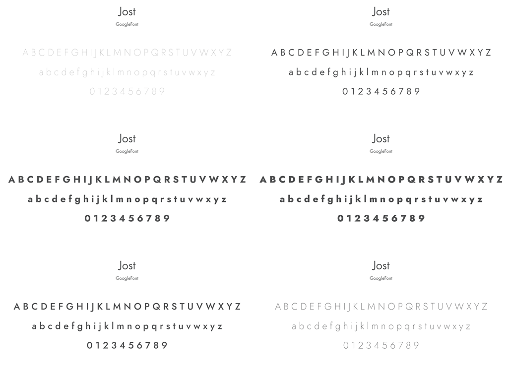
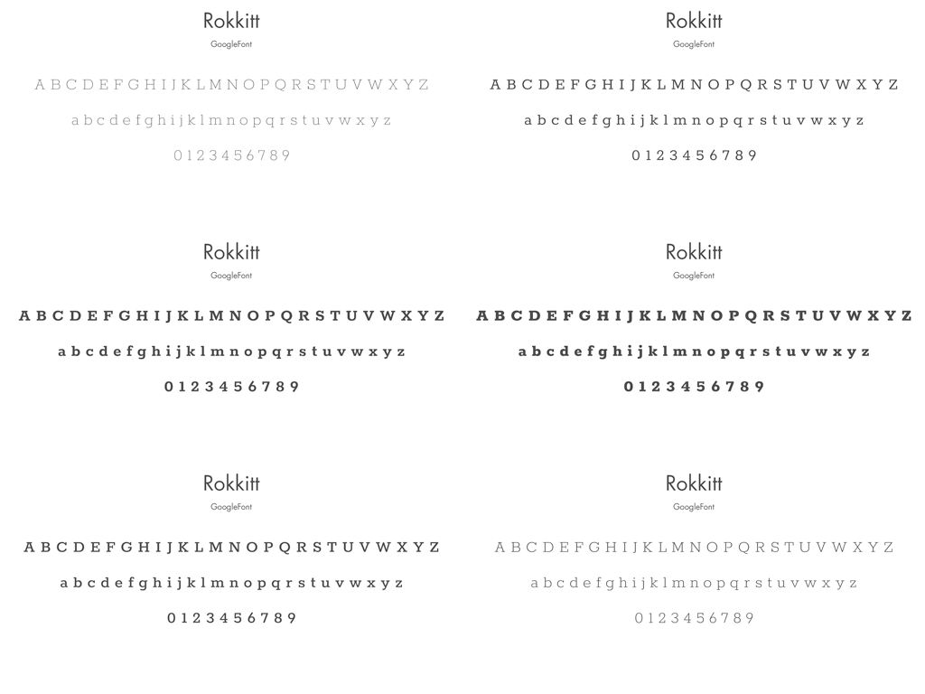
Fonts
Photographic Identity
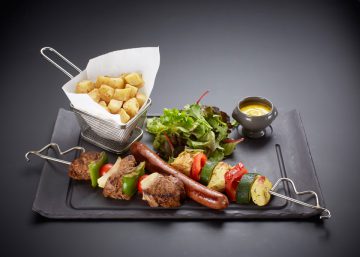
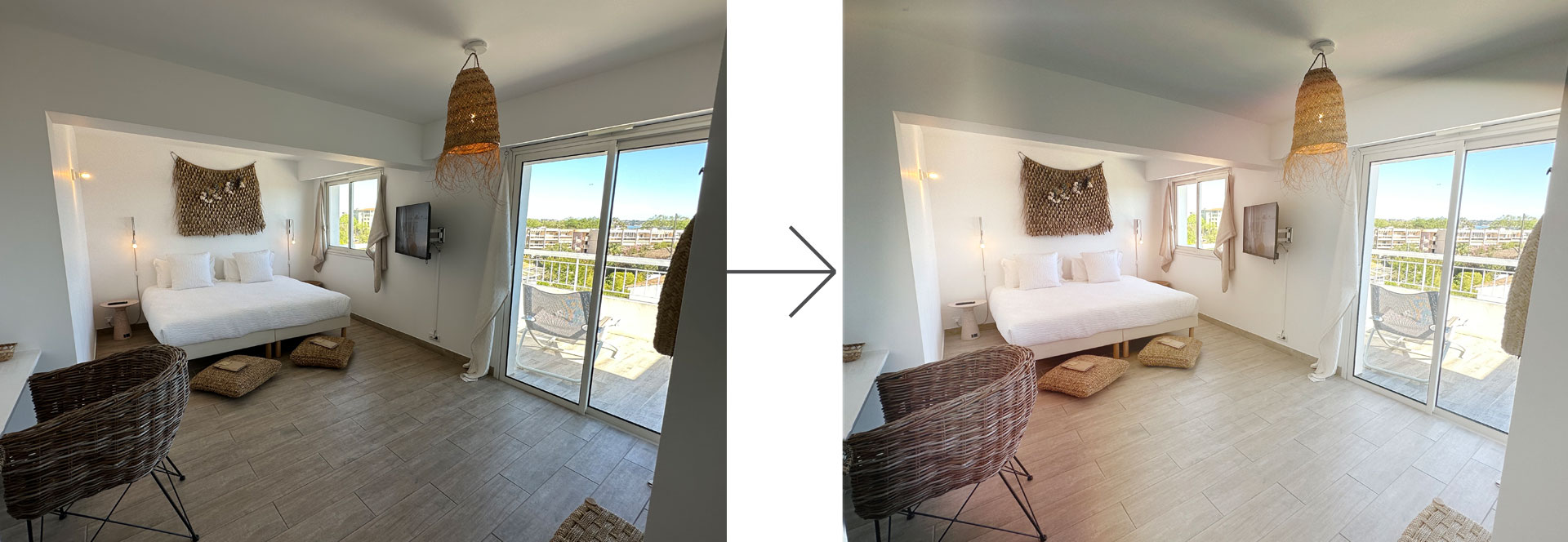
A color effect is applied to the photos used in communications—particularly on the website—to evoke the sunshine of southern France.
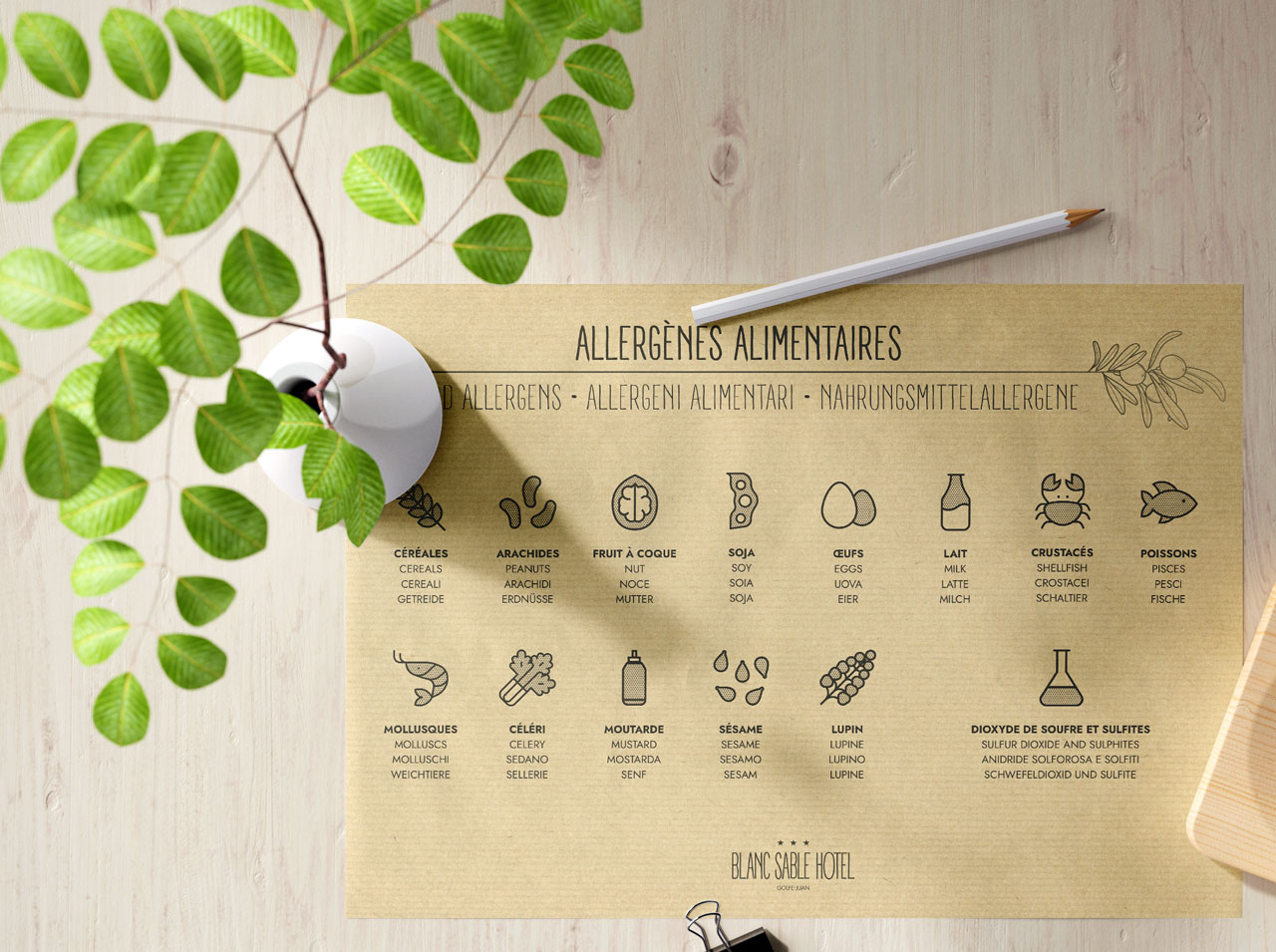
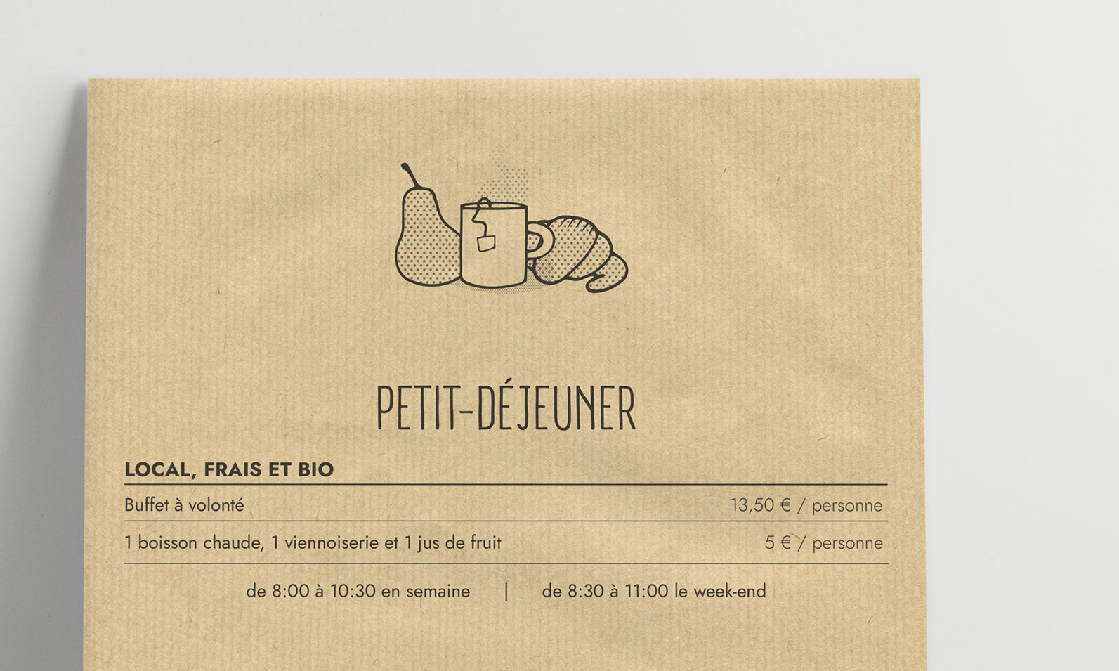
Pictograms and Illustrations
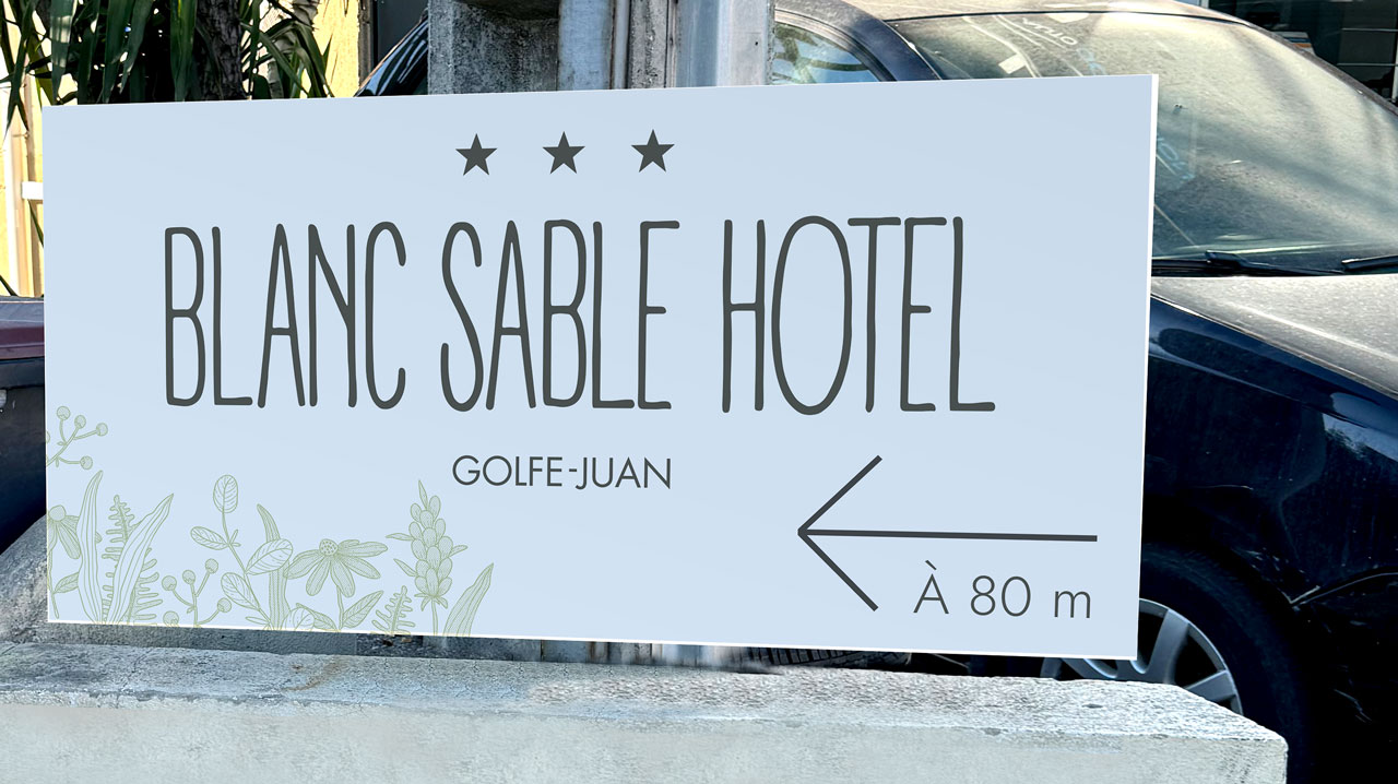
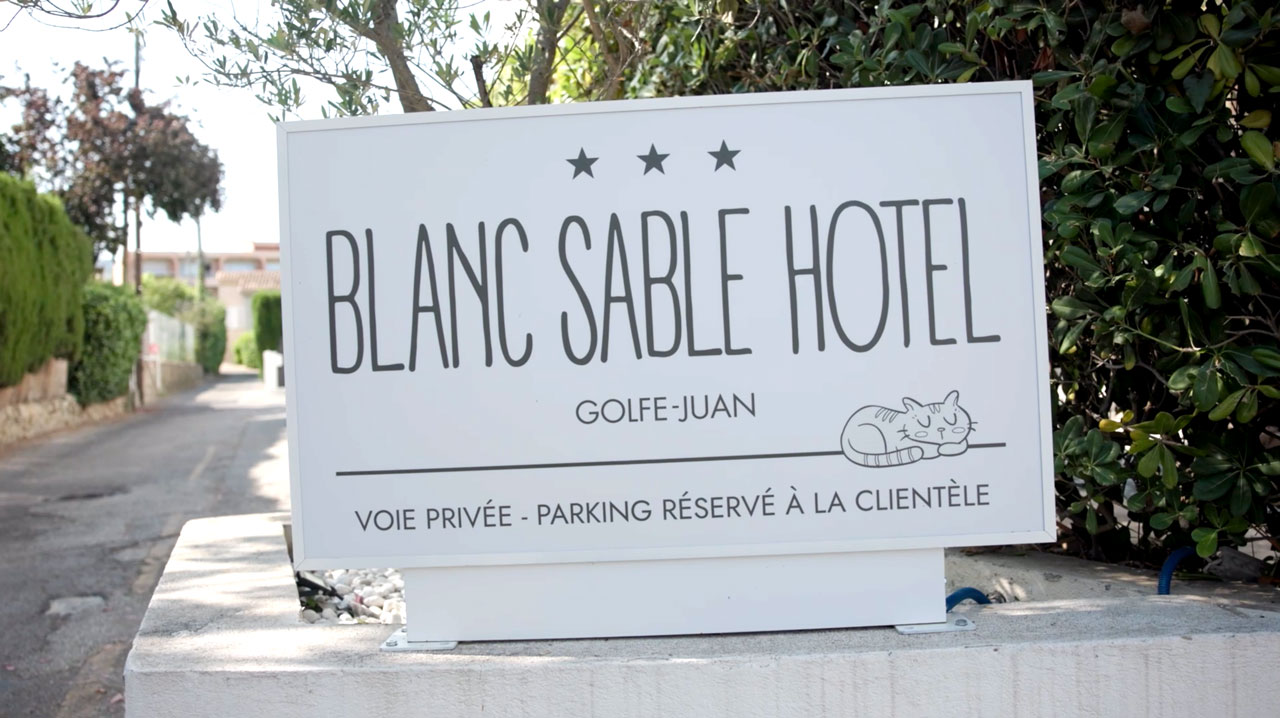
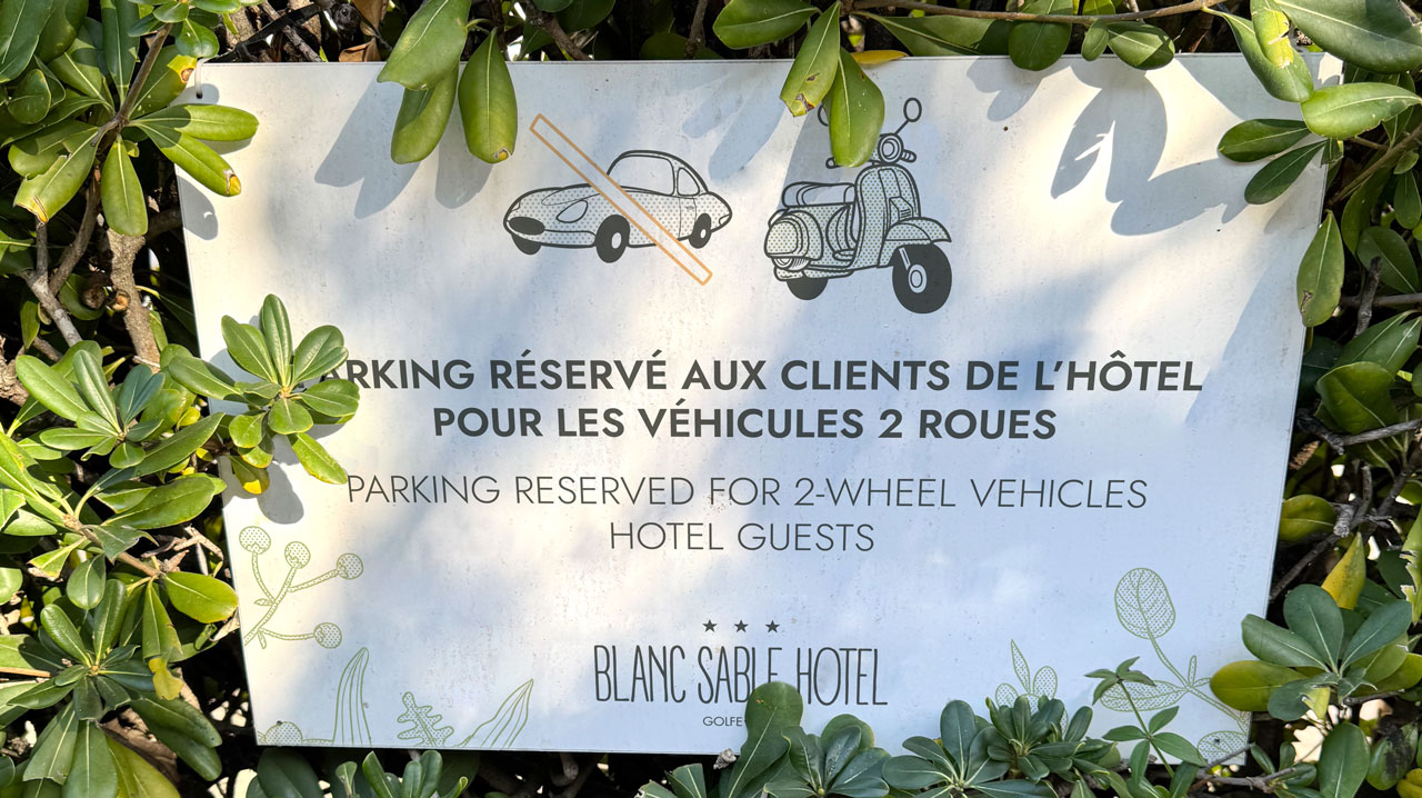
To communicate with international customers, the use of drawings helps them understand the message, in addition to providing a light and friendly image.
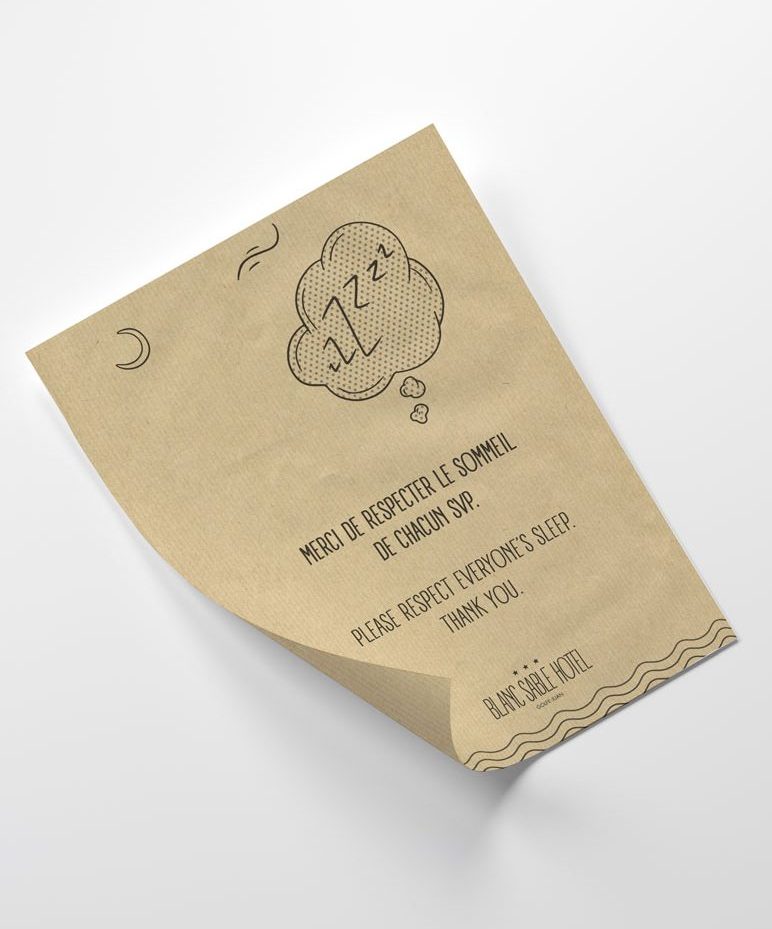
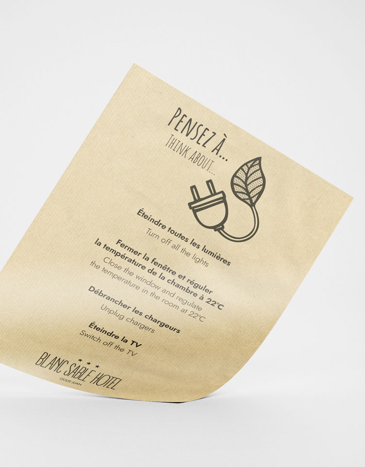
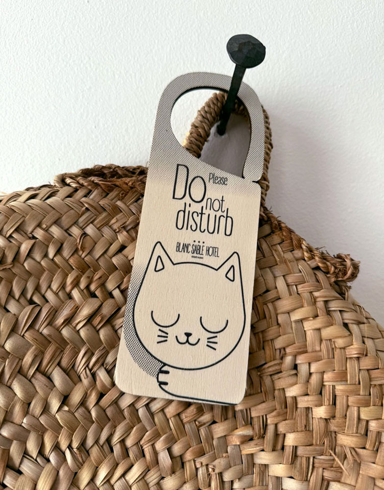
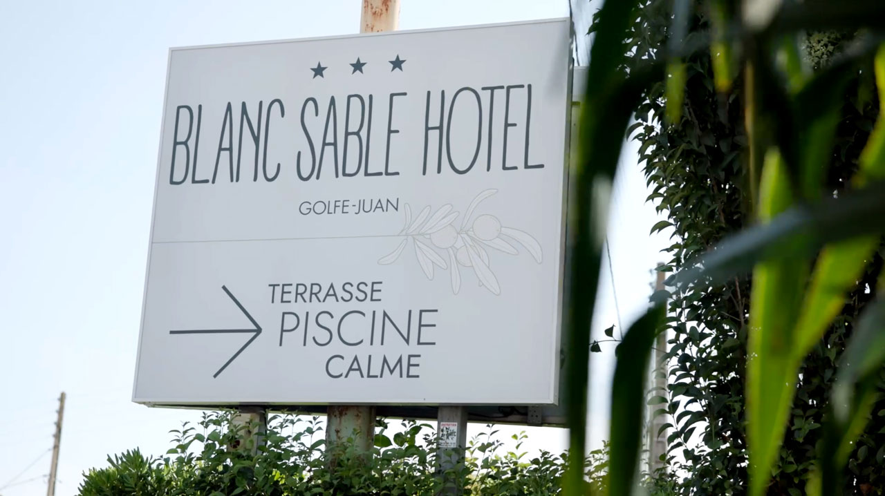
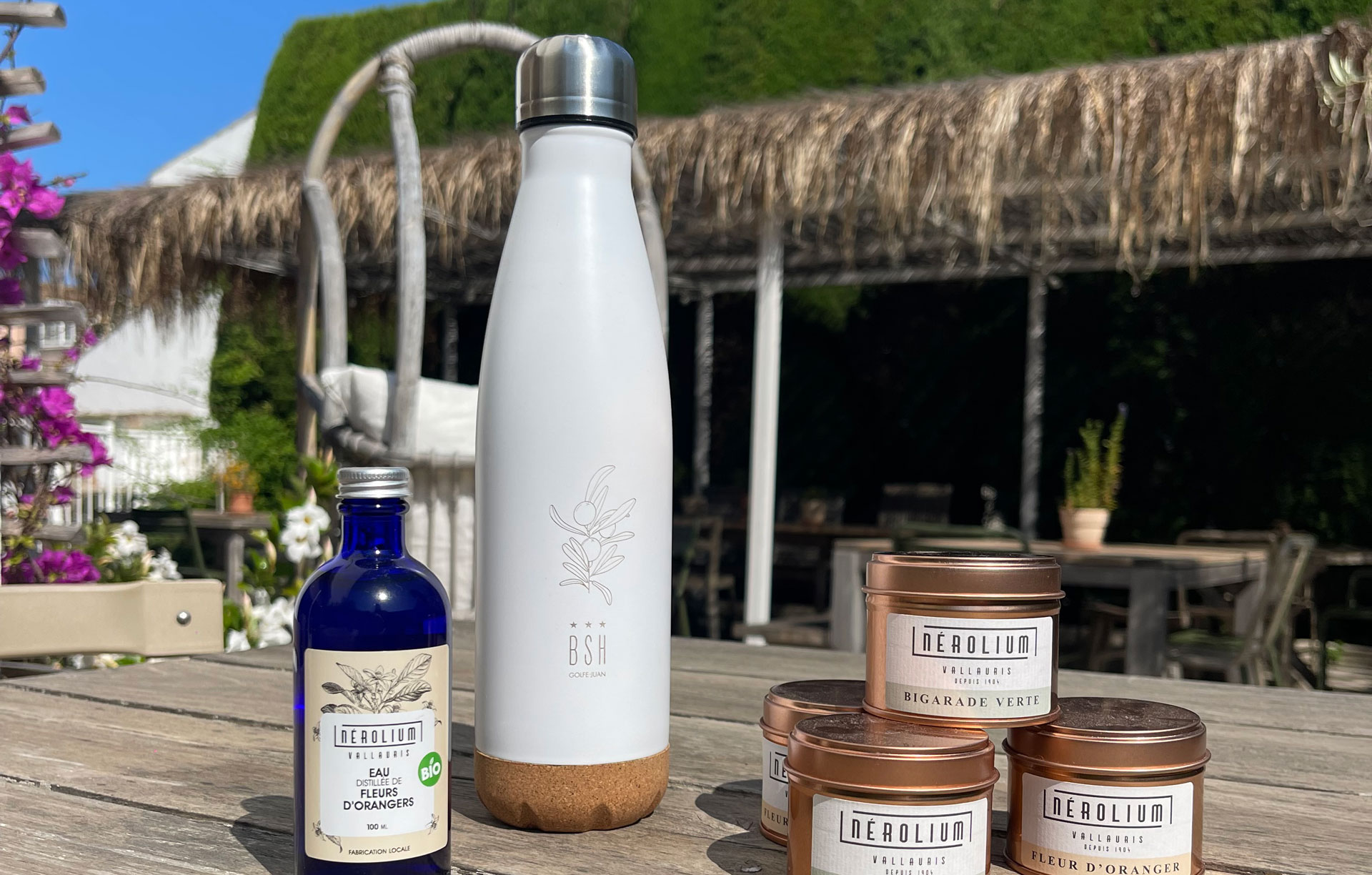
Goodies
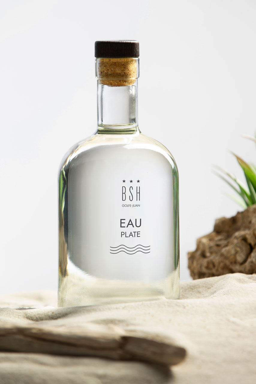
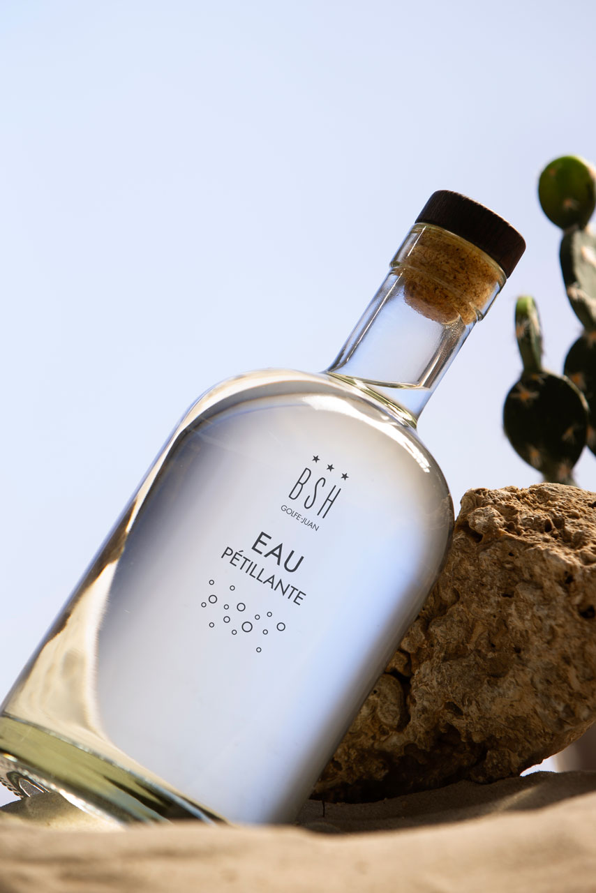
The boutique-hotel uses and sells personalized products, inspired by eco-design.