A creative agency founded in 2002, UOVO operates in the various fields of global design, from communication to commercial layout.
The decision of a graphic redesign for a company is always taken with great caution. Costs, loss of customer bearings, fear of change, poor understanding of one’s identity by employees and customers…
For a communication agency, it is also a showcase that illustrates its creativity and its ability to communicate. The decision is sometimes hard to make, but the company must evolve with the times.
This will be the challenge of the graphic redesign for UOVO.
- UOVO
- Global communication
- Identity
- uovo.fr
Above all, the first question we ask our customers who want a redesign is: why?
Why now, why change, …?
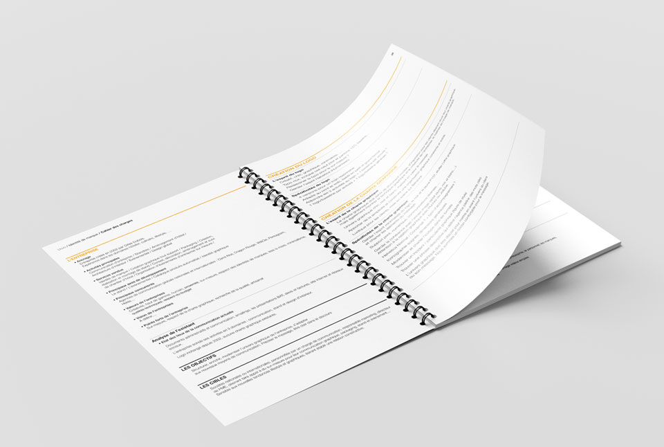
The first step will be the specifications book.
It makes it possible to study the context of the company, its desires for evolution and the wishes commercial directions. It punctuates the entire project with one of the key words or phrases that will serve as a guiding thread for the brand universe and its market’s positioning.
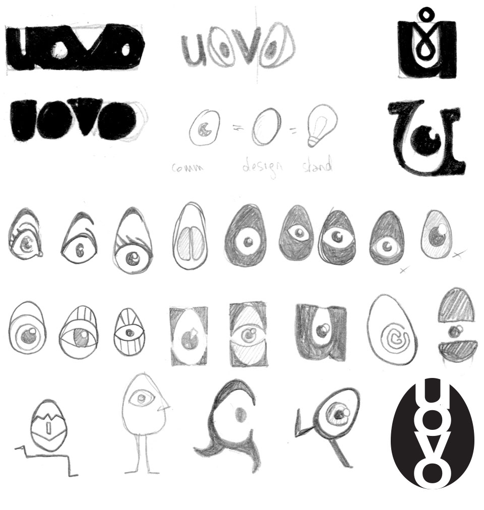
Graphic logo research is exciting.
In addition to the design, you have to keep in mind the evolution over time and fashions, and stick to the specifications.
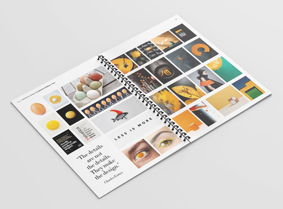
We use trend boards for inspiration.
This allows us to push the imagination as far as possible.
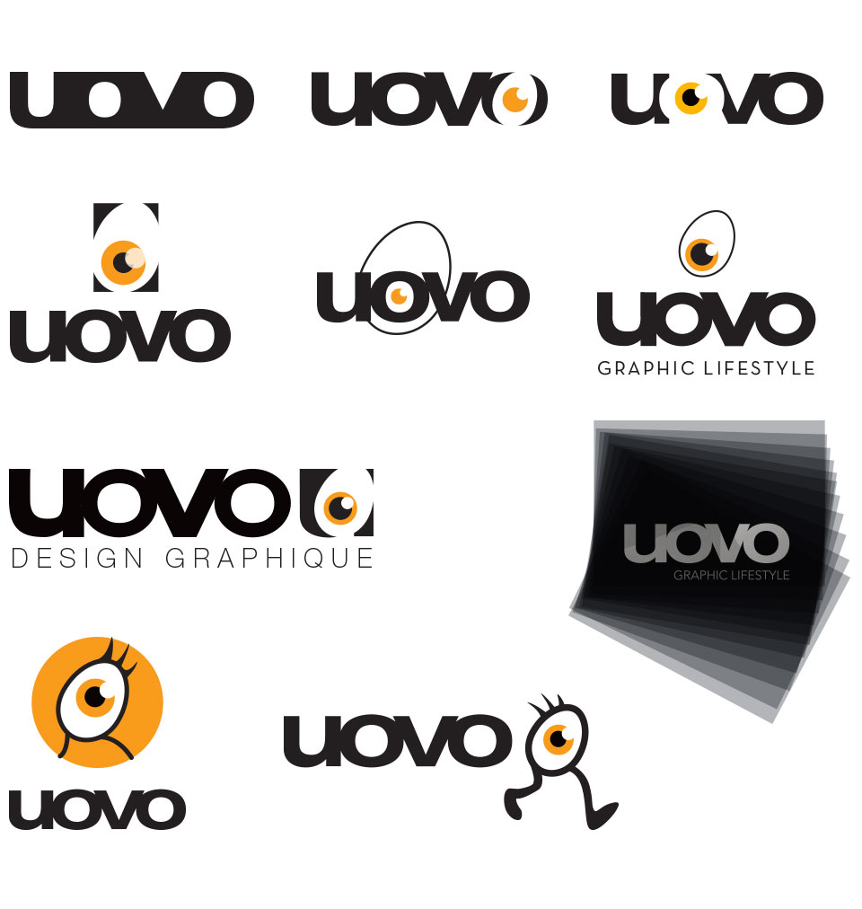
The (good) constraint was to keep the typography of the word UOVO, however we redesigned it to improve it on digital display

For the icotype, we first started from the egg and the eye, in Less is more mode, but the legs finally became necessary in order not to lose the graphic spirit. It was then necessary to choose its new approach.
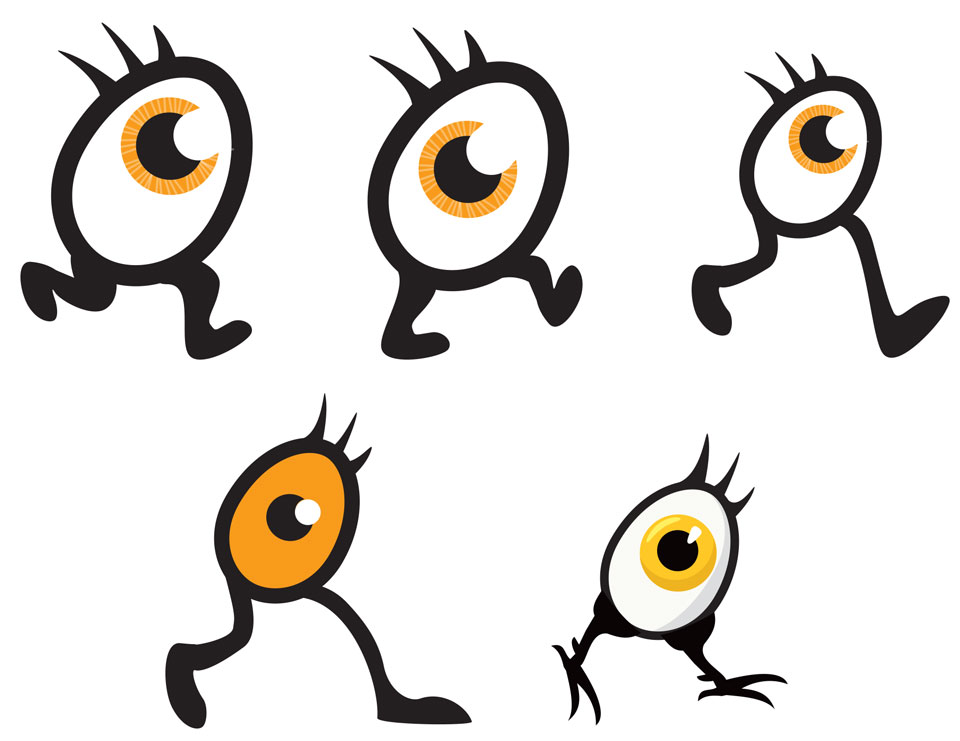
And finally, the new logo…
After several internal discussions, it was decided not to stray too far from a logo that enjoyed good notoriety. We then redesigned, balanced and responsive it to make it more effective on any type of digital platform.
The baseline was brought back from the past thanks to the study of the context in the specifications.

Full version

Without baseline

Without icotype

Icotype and Favicon

Website

Black and white
… and its graphic guideline, always in minimalist mode…
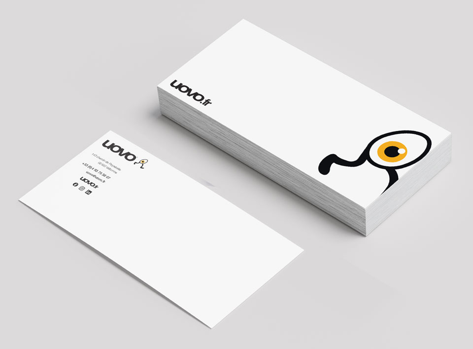
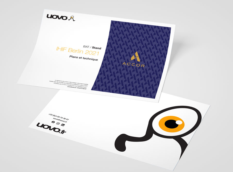
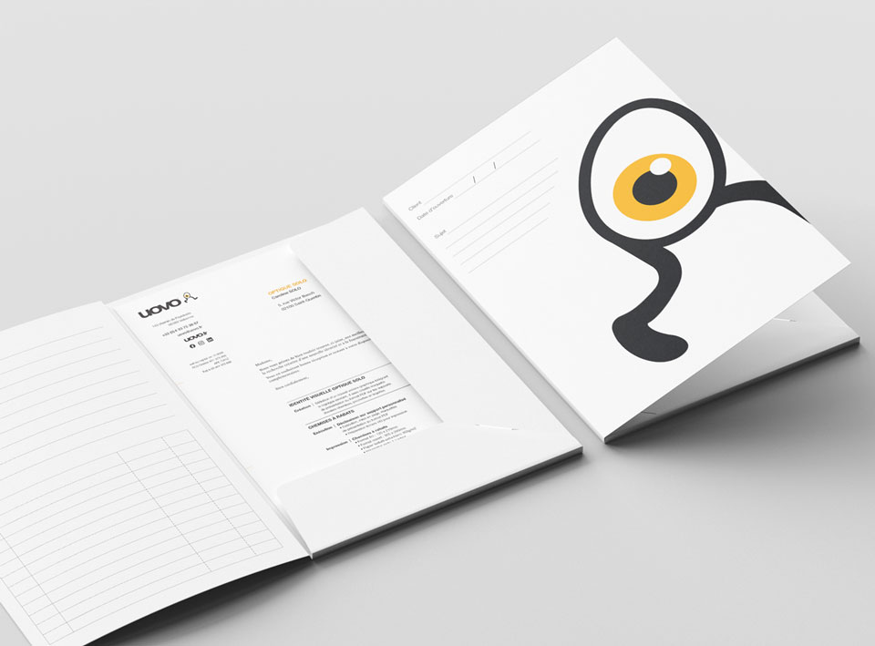
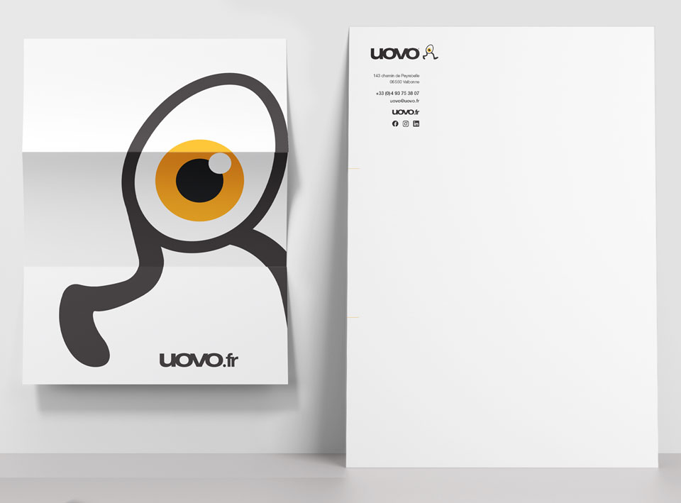
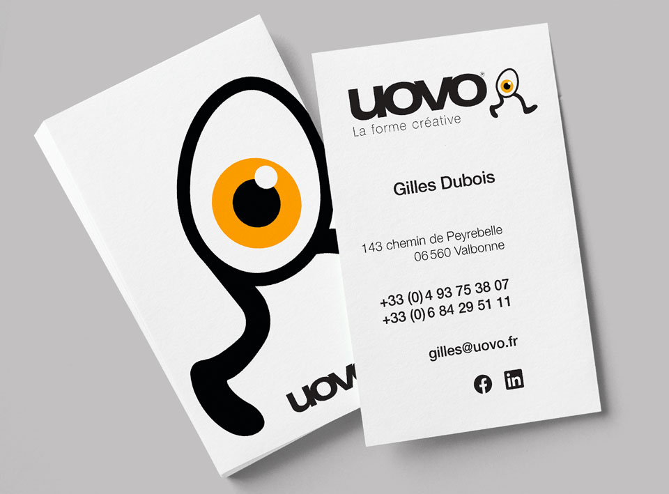
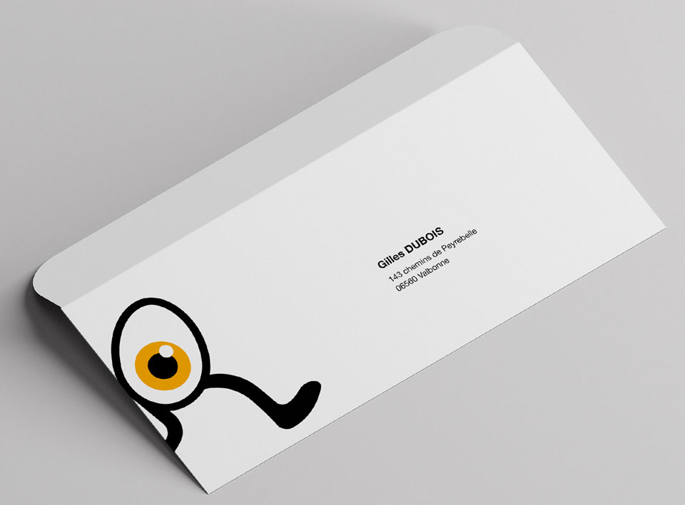
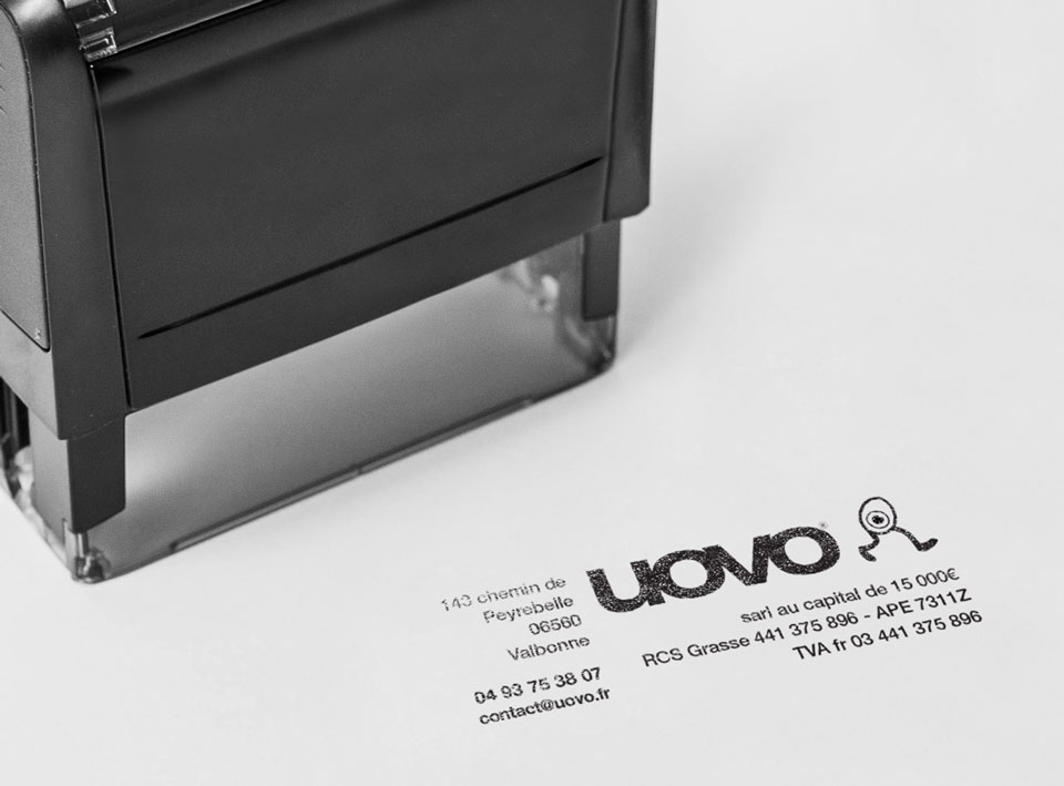
… and its application on any type of print medium…
