It is good and healthy for a company to ask itself the question of a graphic redesign of it brand after 10 years of use.
It was Tellier Gobel et Cie’s desire to review the Louis Tellier brand universe, while changes in product/brand organization were under consideration.
- Louis Tellier
- Cooking accessories
- Identity
- louistellier.fr

We had created the first logo in 2016 for the parent brand, the second in 2012 for the historical subsidiary brand, and were consulted for this redesign. The main mission of the specifications will be to use these 2 logos to imagine the logo of the parent brand.
We made 3 proposals.
Efficiency, precision and simplicity.
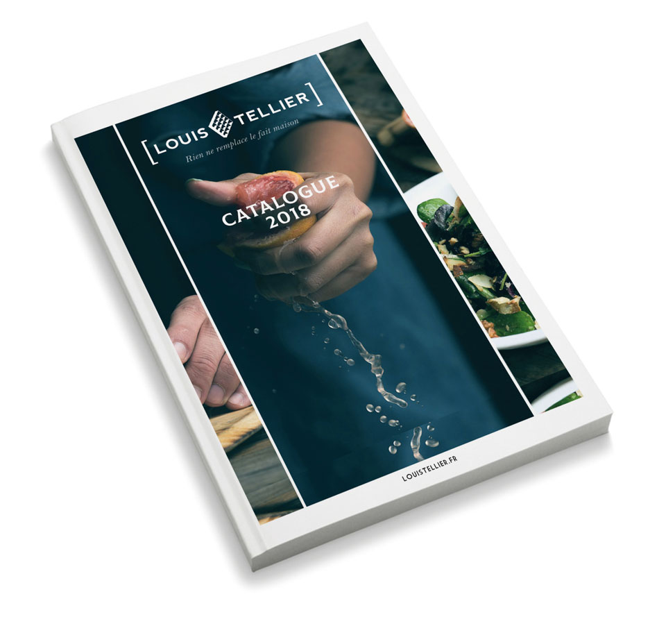
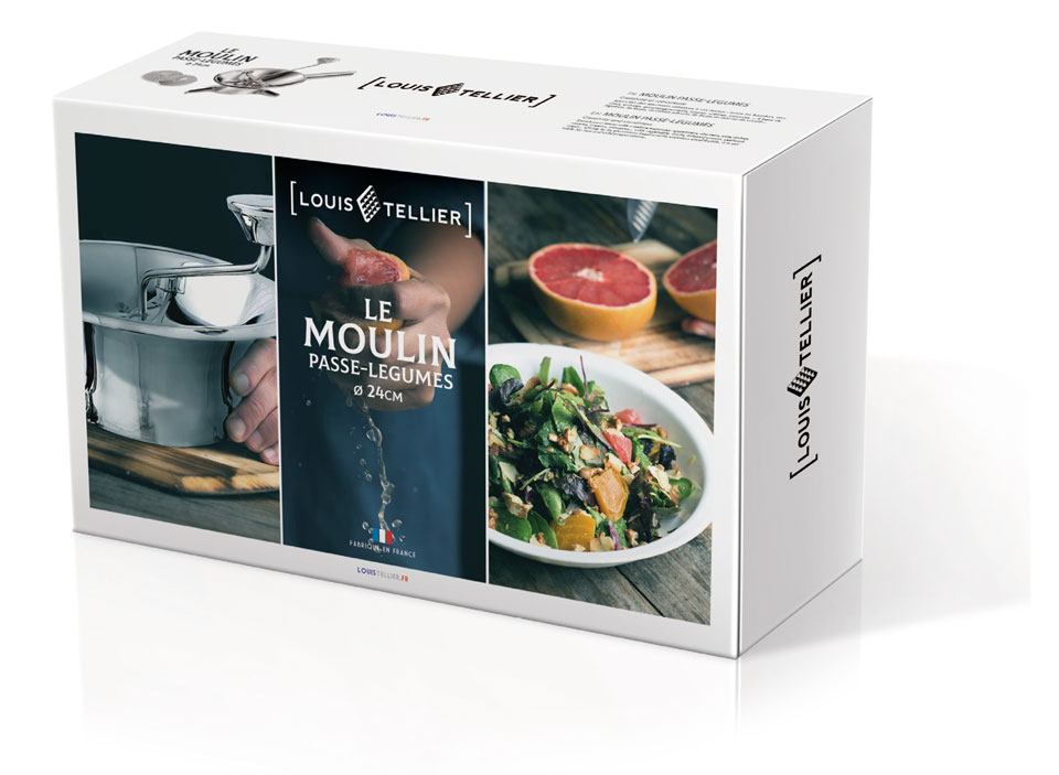
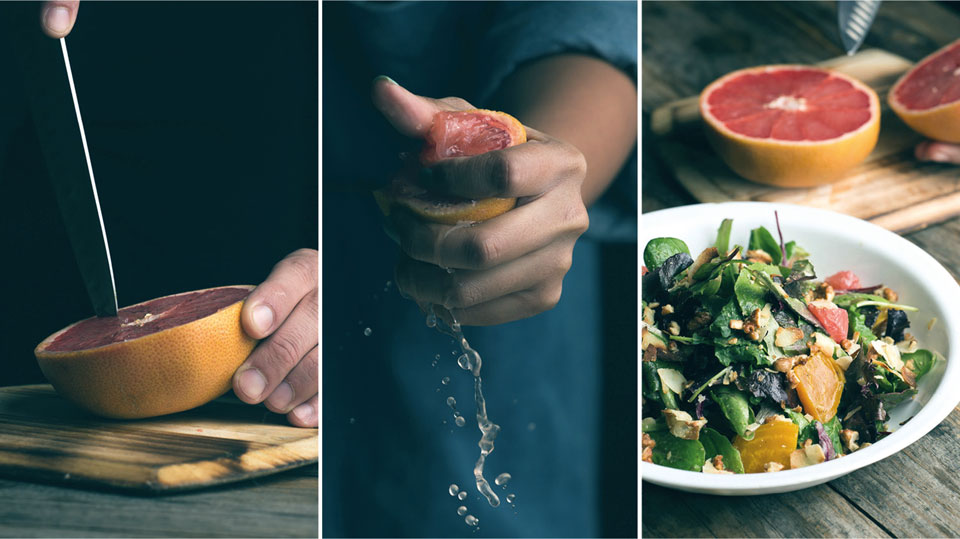
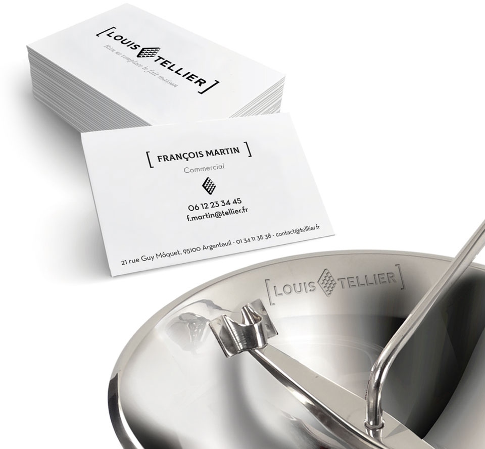
The icotype takes up an emblematic product of the brand. Know-how and expertise are revealed by a simple stick typeface, the parentheses confirm technical mastery. The images systematically show the product, its use and the result. The goal is to express movement, action. Louis Tellier and its users share the same emotions around authentic taste.

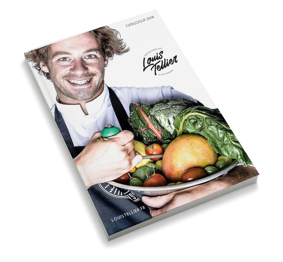
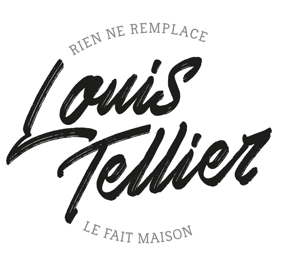
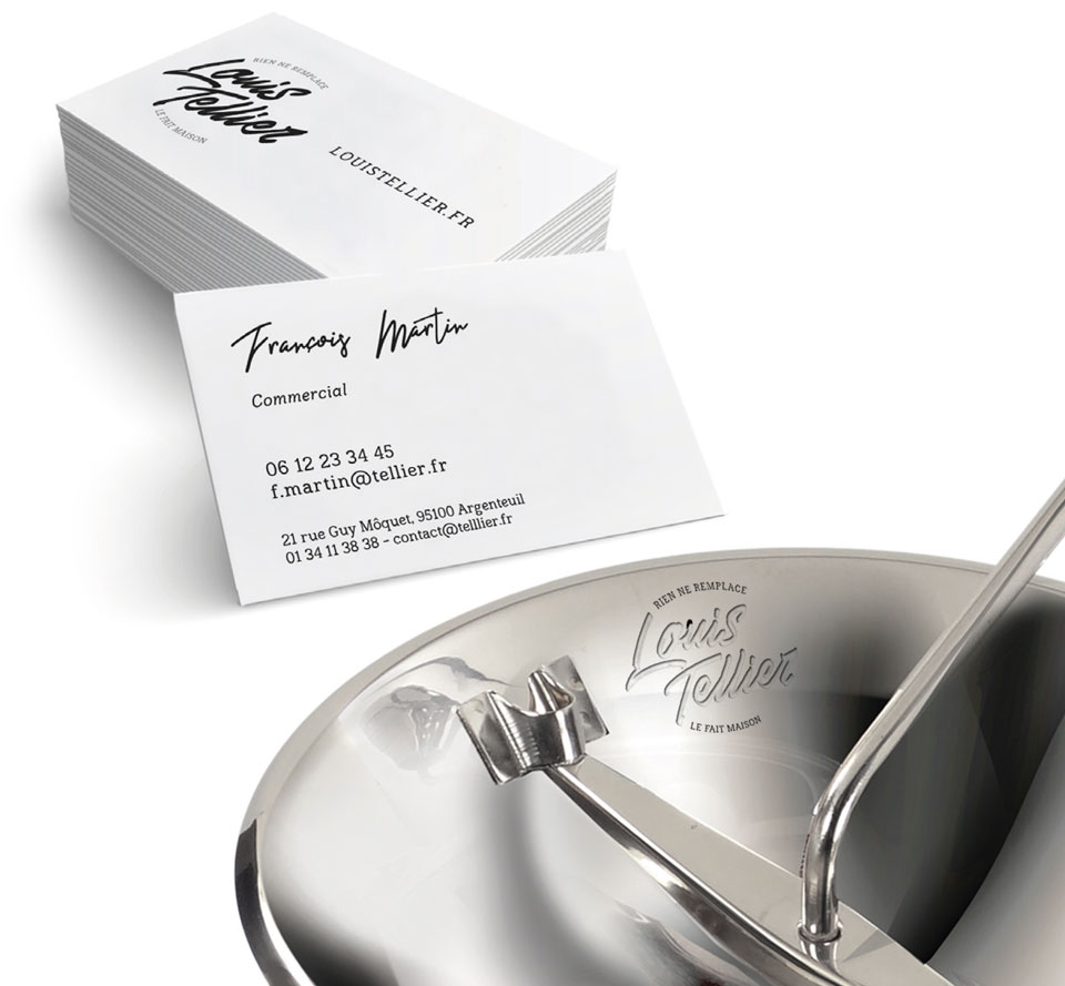
Handwritten typographic axis, like a signature, Louis Tellier is a person, a creator.
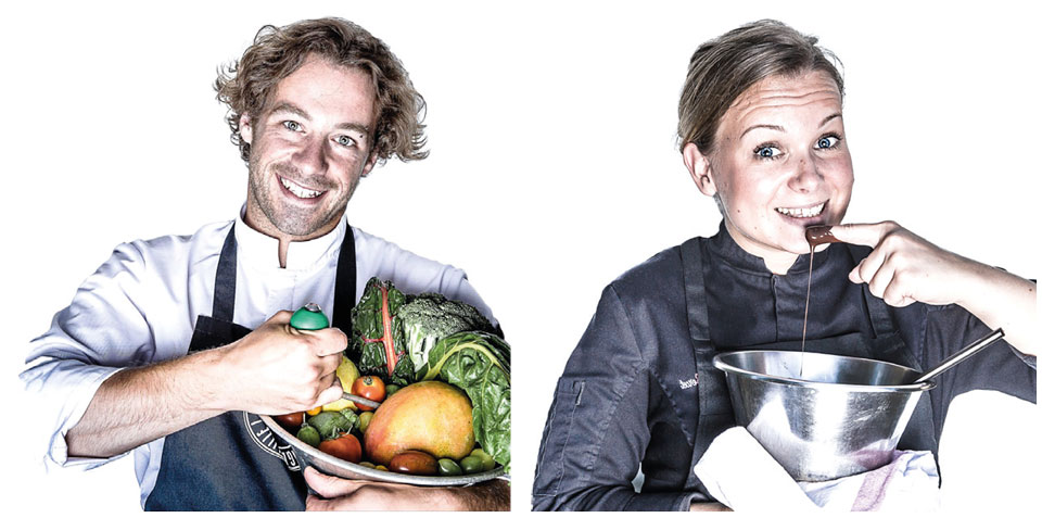
The logotype is treated both as a stamp affirming industrial mastery and also evokes new restaurant signs “bistronomy” trends that will allow both chefs and enlightened amateurs to identify themselves. Smile, share, pleasure, the photographic axis is oriented towards the user.
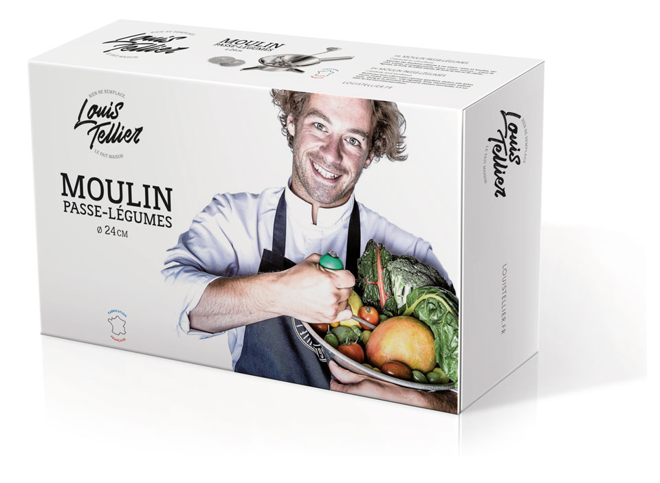
The LT icotype is reinforced and assumed, the historical emblem of the brand of PRO users.
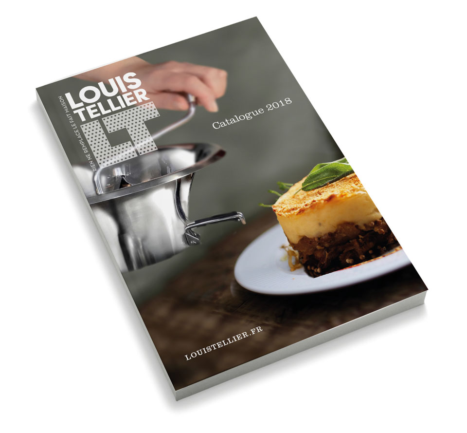
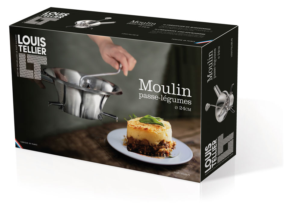
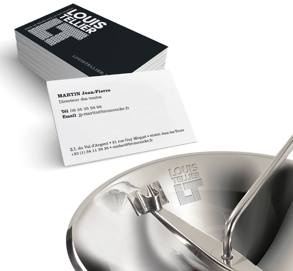
Its design highlights industrial know-how, with a nod to the original product. The wide, solid and modern typographic treatment will also reach chefs and enlightened amateurs. The photographic treatment will take up the codes of the 1950s, in particular by using visual elements of the time, with a chromatic aspect borrowed from film photography.

These proposals were not retained.
However, we had fun thinking about the graphic positioning of a historic French brand.

